Date
2022
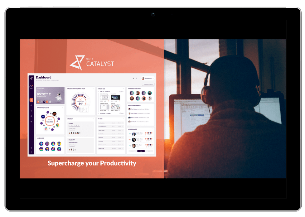
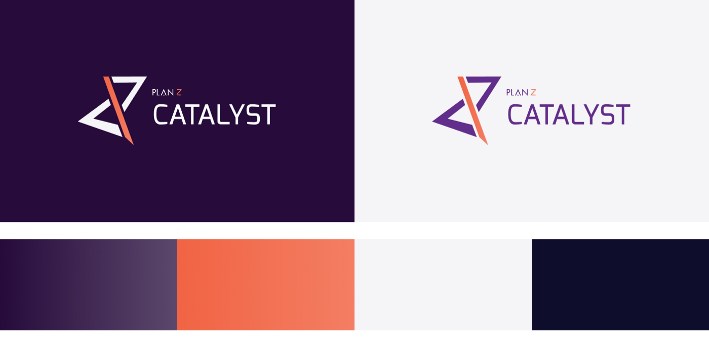
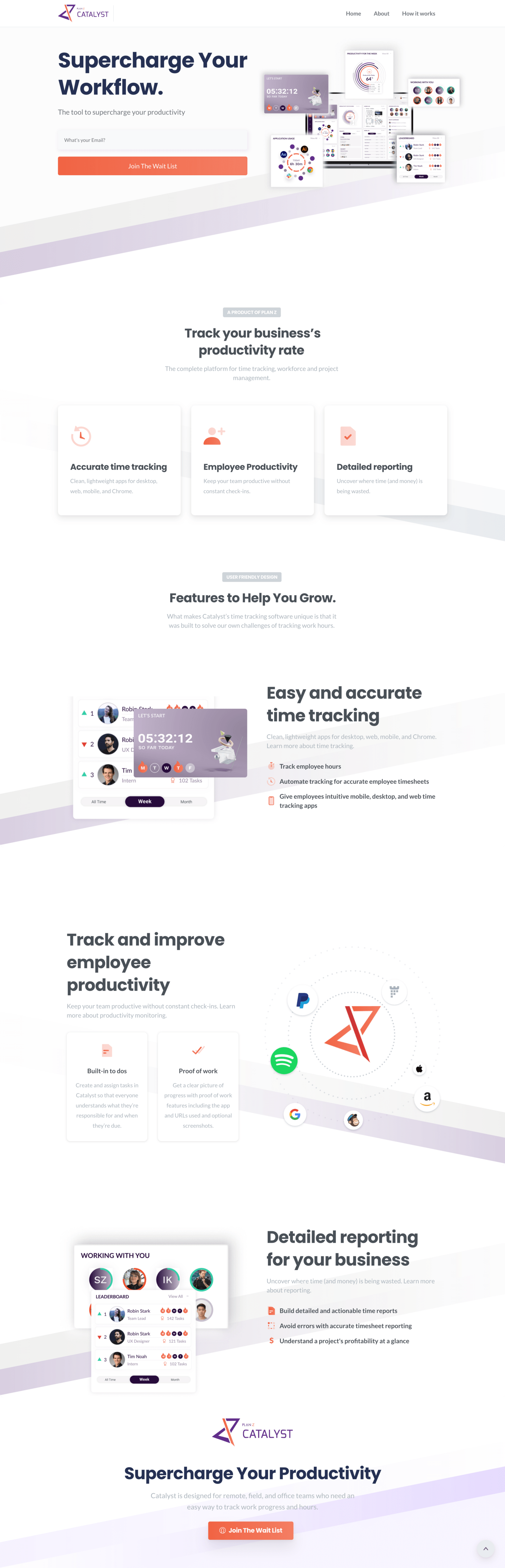
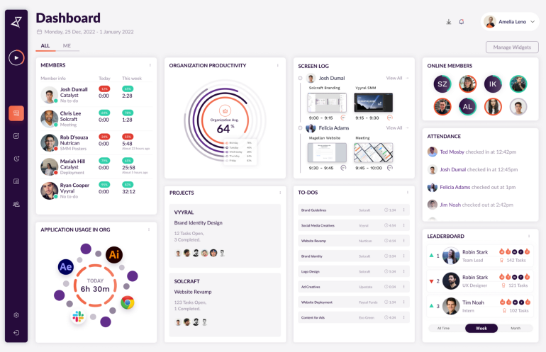
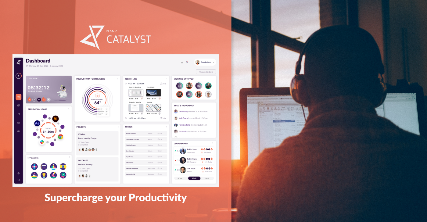
Project Name
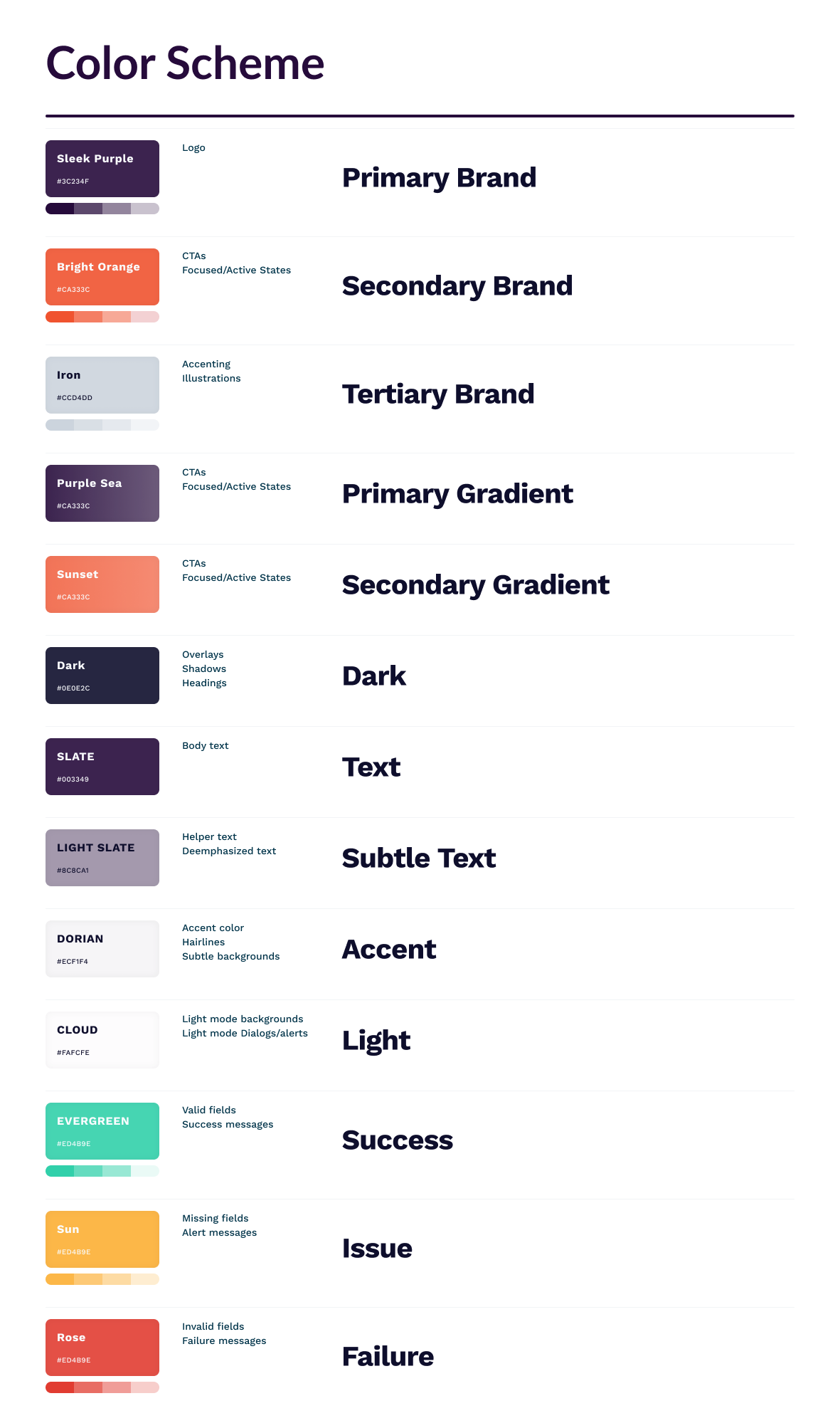
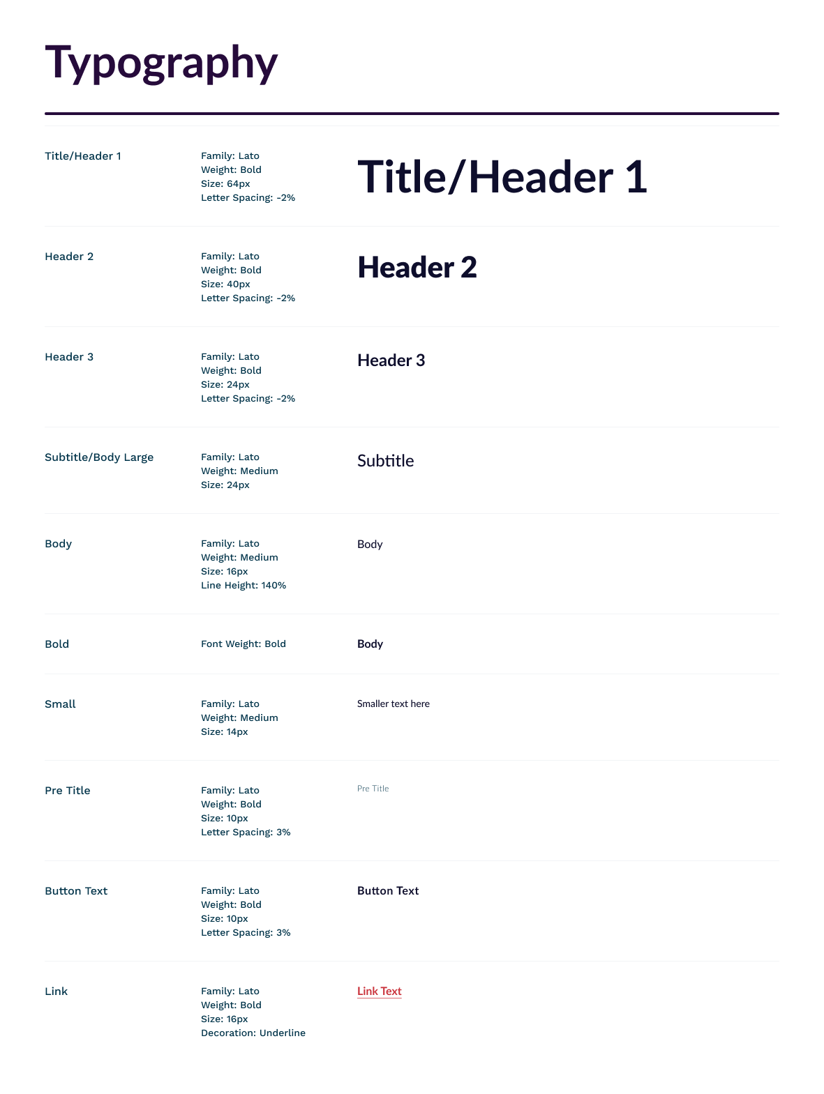
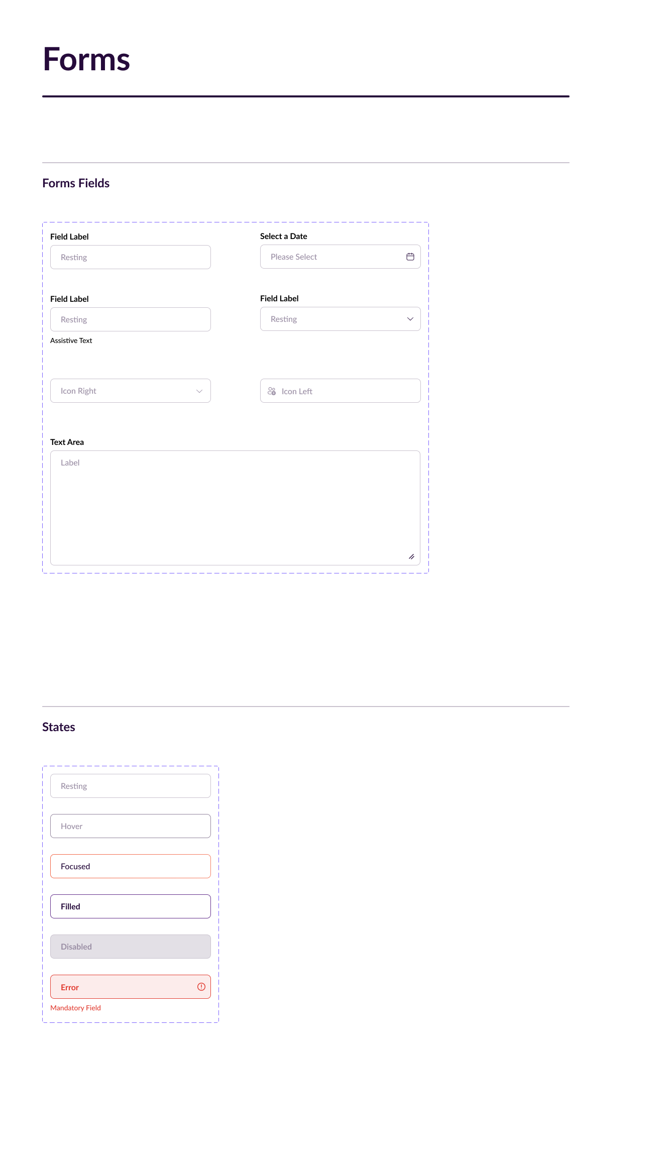
Catalyst
Client
Plan Z
Category
SAAS